

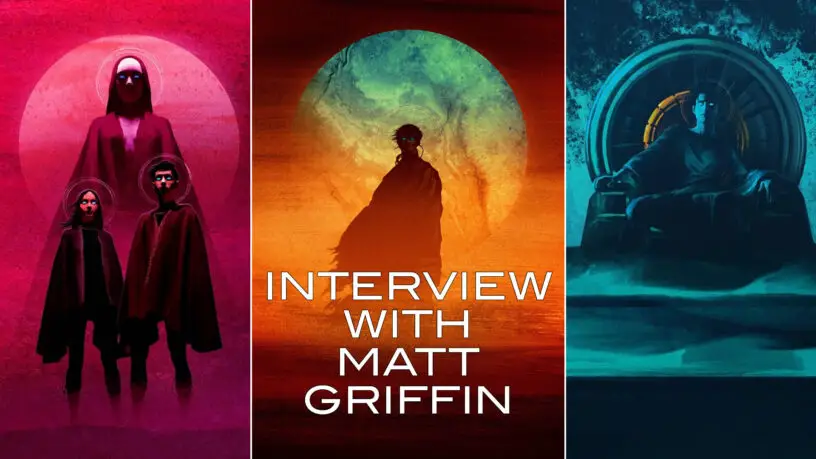
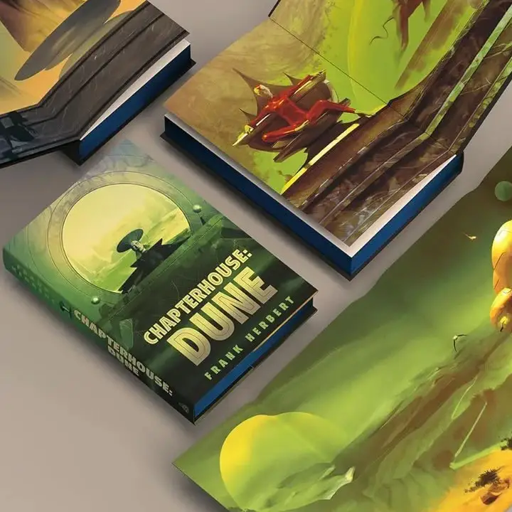
Even if you don’t know the name, the chances are that you are familiar with the Dune artwork by Matt Griffin which has graced book covers (and interiors) of multiple novels.
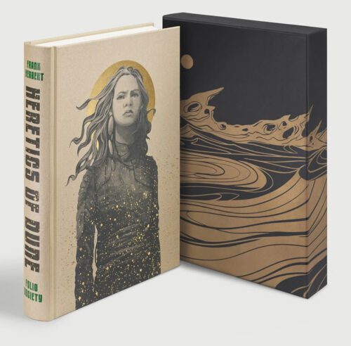
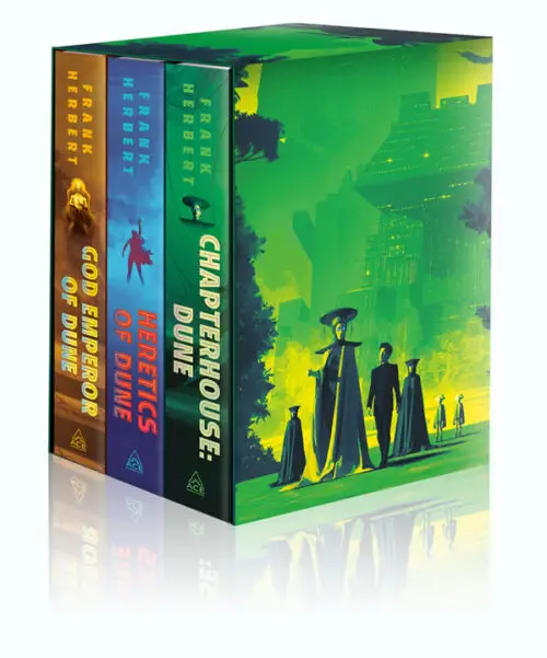
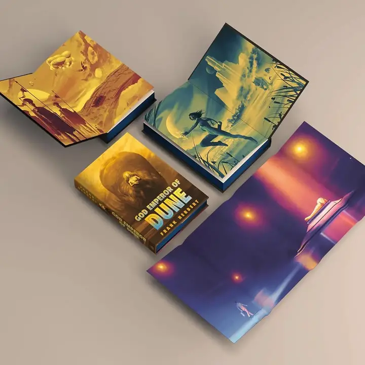
With Heretics of Dune being released by The Folio Society in October 2026, and the long-awaited release of books 4-6 of Frank Herbert’s Dune Saga (God Emperor of Dune, Heretics of Dune, and Chapterhouse: Dune) by Ace/Penguin Random House in a Deluxe Hardcover Boxed Set on 3rd November 2026 Matt kindly agreed to answer questions from the Dune community about his journey along the Golden Path.
Interview
Q: What was your first introduction to the Dune universe?
Matt: My first taste of Dune was the David Lynch film. I come from a film-crazy family, particularly my Dad, so I was brought up watching movies of his era – 50s/60s Roman epics and the like. As long as it was epic, genre didn’t really matter, and while it has its detractors (including Lynch!) that Dune is definitely epic. It was a family favourite, we watched it at least once a year throughout my childhood. Then, when I was 14, I read the first book and decided there and then that someday I’d love to illustrate it.
Q: What stands out to you, from a visual viewpoint, from Lynch’s Dune movie?
Matt: There’s a lot visually that stands out, like the brass machinery in the training room, almost like Victorian automata. Those iconic still suits, the orange lightning of ‘Worm Sign’.
But it also contains my favourite piece of production design in any film ever: the vast, ornate entrance to the Guild heighliner, with all the Atreides ships dwarfed by the scale of it. It’s a spaceship in the far future but the design is so classical (which is perfect for a story like Dune, which refers to its ancient history all the time). There is something about the marriage of scale (both in terms of the size of the ships and the distance in time) and the classical design, evoking old temples etc, that just blew my mind at the time and still does.
Q: The first Dune artwork I remember seeing of yours was the one of Paul in front of the moon. Can you tell us more about the origin of that image, and the subsequent reactions to it from the Dune community?
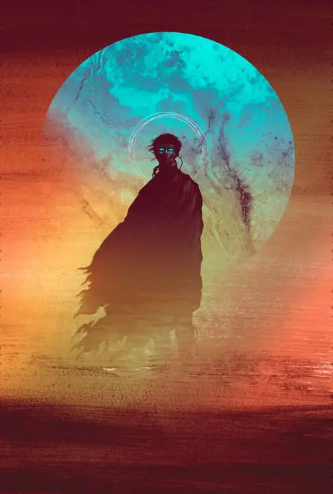
Matt: Yes that’s the image that will probably go on my headstone 🙂
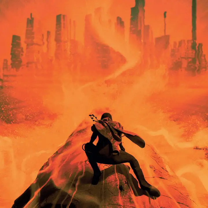
It started out through play. I was stuck, experiencing a little block. So when that happens, I play. I forget about making anything good, and just make. I was playing with textures; photos of random surfaces, charcoal, ink and water, anything I could get my hands on. And I came up with this texture that looked to me like a sandstorm. I instantly thought of Dune.
I thought I’ll keep going with the ink and I’ll paint a figure of Paul on to it. It was terrible! But I scanned it and switched over to digital where mistakes can be undone easily…
I made an image I really liked (including one of those photo textures for the ‘moon’ – a picture of a marble tile in a bathroom!) I posted it online and didn’t expect any kind of reaction. But there was a big reaction – it got a lot of shares, particularly on Tumblr. So it seemed to resonate with Dune fans from the start.
Q: The poster was used as the cover for a reprint of Dune by Ace/Penguin Random House, and you’ve gone on to work on all 6 Frank Herbert Dune novels as well as several of the prequel novels by Brian Herbert and Kevin J Anderson. How did that come about?
Matt: After the original image had been shared quite a bit, I was contacted by a Penguin art director I had worked with previously. He said they were making a new edition of Dune and would like to license that piece for the cover.
Of course, I jumped 20 feet in the air! But I calmed myself and suggested an illustrated edition so I could fulfil that 14-year-olds dream and follow in the giant footsteps of one of my heroes, John Schoenherr.
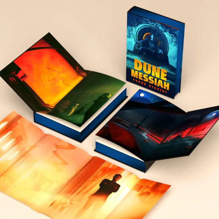
They came back and said that while it wouldn’t be a fully illustrated edition, they were now going to make it a deluxe edition, with illustrated endpapers etc. The dream was coming true.
It should also be pointed out, the original image was a lot more muted. It was the AD (shout out to Adam Auerbach) who suggested ramping up the contrast, which made it much better.
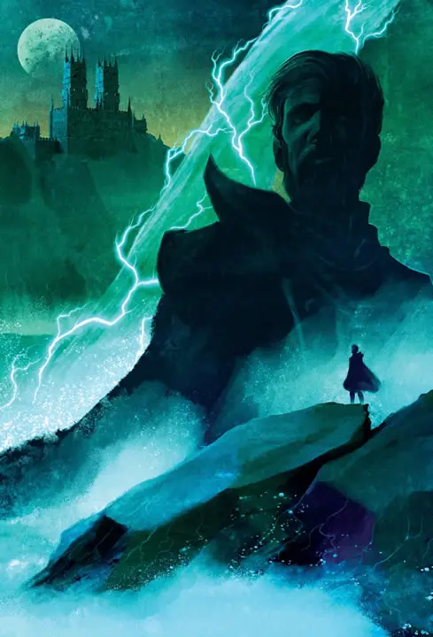
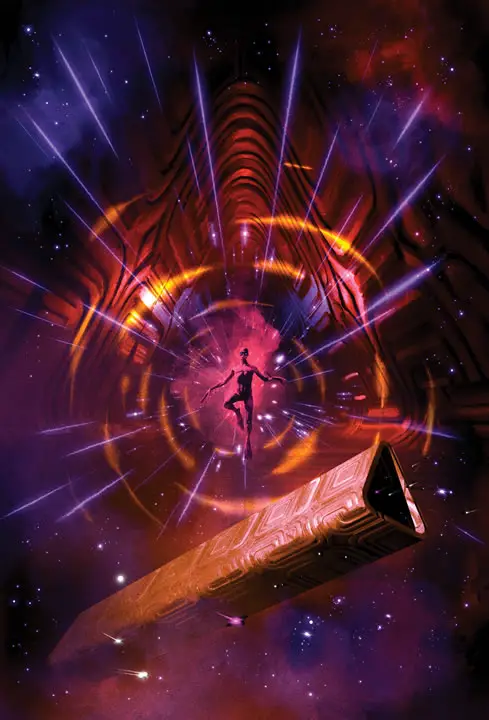
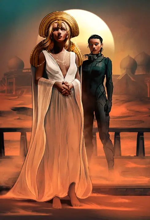
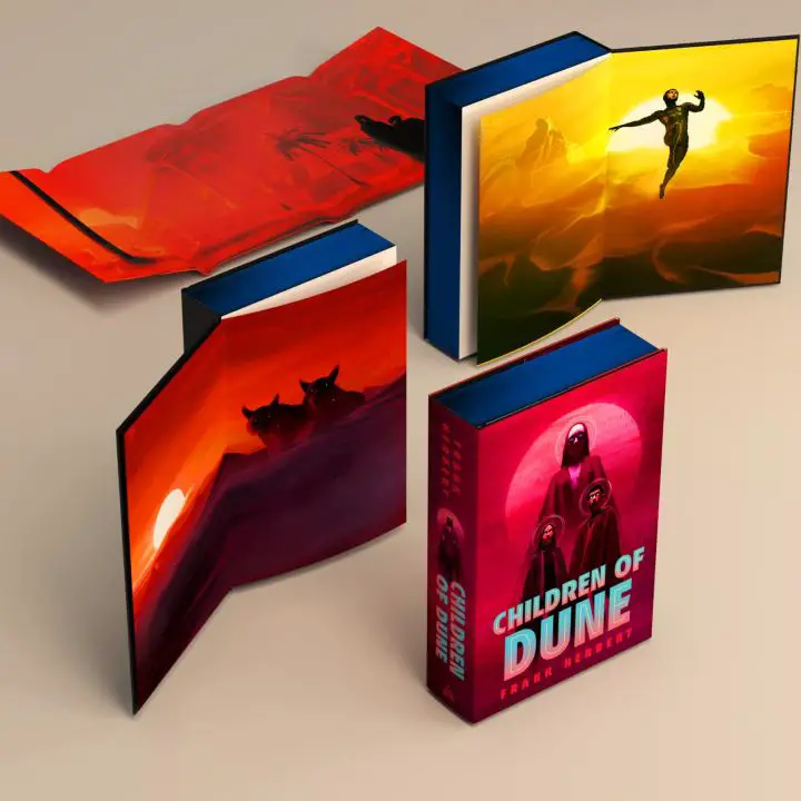
Then as you say, in the years since I got to do so much more Dune work that it’s become by far the property I’m (happily) linked with most. I can’t quite recall if the Tor covers (for books like Duke of Caladan, Sands of Dune and many more) came before or after Dune Messiah and Children of Dune for Ace. But I was delighted to do them, and also when I got the chance to follow up the first deluxe edition. And then I waited patiently for books 4-6, never sure they would actually happen. I was so happy they did.
Q: When creating the interior illustrations (which you have done for both for Dune and other novels), what is your process for picking the scenes to depict?
Matt: Reading for these types of projects is a little different for me. I feel I need to soak in the story even more than I normally would. Scene selection is of course about important story beats, or what might just make for ‘cool’ visuals. But if I’m doing images throughout the book, they have to be in harmony with the story. They need to propel it, somehow, if that makes sense. So, I feel I need a comprehensive understanding of the flow of the story, and the reading therefore is a little more intensive than I do for pleasure when I go to bed. 😁 All of that sounds very pretentious! But it’s how I work.
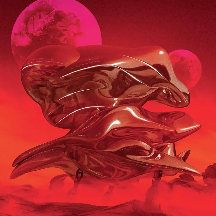
Sometimes it’s just because it would be cool to depict. I mean, for the first book I had to draw Shai-Hulud. 😊
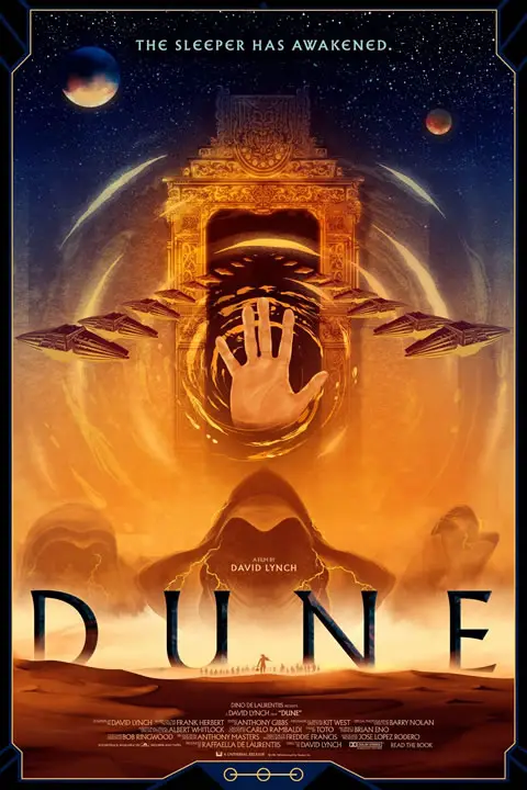
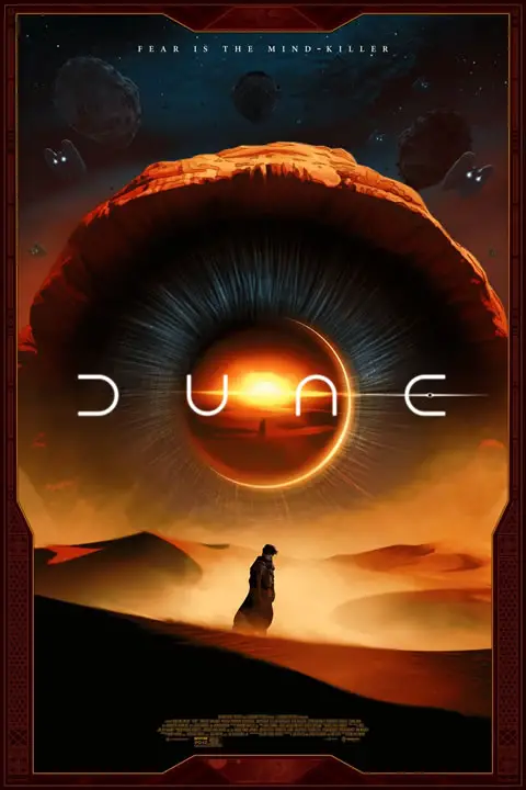
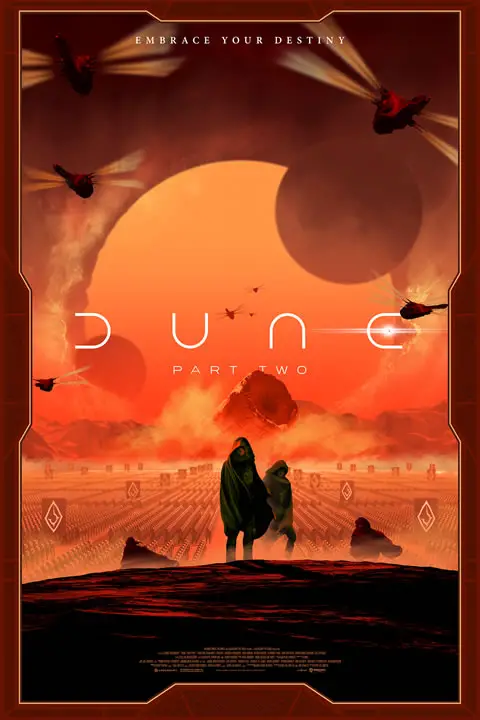
Q: You’ve also created officially licensed movie posters for Lynch’s Dune and Denis Villeneuve’s Dune: Part One and Part Two. Is there anything Dune related left that you have on your wish list?
Matt: Yes, licensed movie posters are a big part of my work life, which I love because I love movies. As for anything Dune left, well… I’m not done yet. 😁
And on the wish list, there was one thing but it didn’t happen, sadly. I would love to have designed something – just one tiny thing – for the Villeneuve films. Even a tiny something in the background that no one notices. A cup on a shelf. But alas, can’t have it all. 😁
Questions from Social Media
We asked Dune fans on social media for their own questions for Matt…
Johnny Sobczak: There have been visual representations of Dune since John Schoenherr’s illustrations in Analog in 1964, and you’ve admitted to drawing inspiration from David Lynch’s Dune for some of your art. Is there anything in the new movies or the TV show that fans have told you remind them of your art?
Matt: Yes Schoenherr will never be surpassed, he is the true GOAT. 😁
I’m putting a tl;dr here because it’s a long answer: not in particular but I know it happens.
This is an interesting question because I am an artist who loves nostalgia and very much wears influences unashamedly on sleeve. But, I also try hard not to let contemporary takes affect me. I try – but it’s impossible.
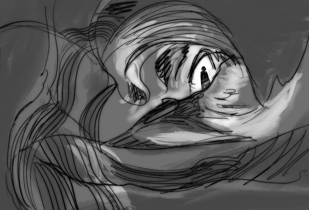
I’ll give you two examples. Way back when I did the first book, I thought my take on Shai-Hulud’s mouth was quite novel. It’s taken from a Sea Lamprey (look them up, terrifying) as at the time I had just done a magazine cover featuring one. Only after that image was long out, someone pointed out its similarity to the amazing Marc Simonetti’s take. Marc is a friend and an all-time great Dune artist. I was horrified. But we spoke and it was all cool. I don’t know if I had seen his and it was subconscious, or if we both just happened to think of a sea lamprey. This happens all the time, especially in pop culture art. Because we are all drawing from the same well.
[Editor’s Note: An early sandworm illustration from Jodorowsky’s Dune also takes inspiration from the sea lamprey, and that artwork pre-dates both Matt’s and Marc’s designs!]
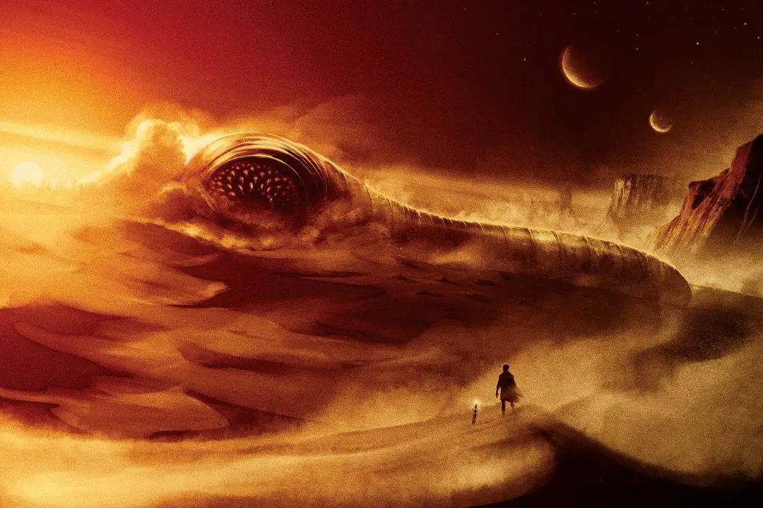
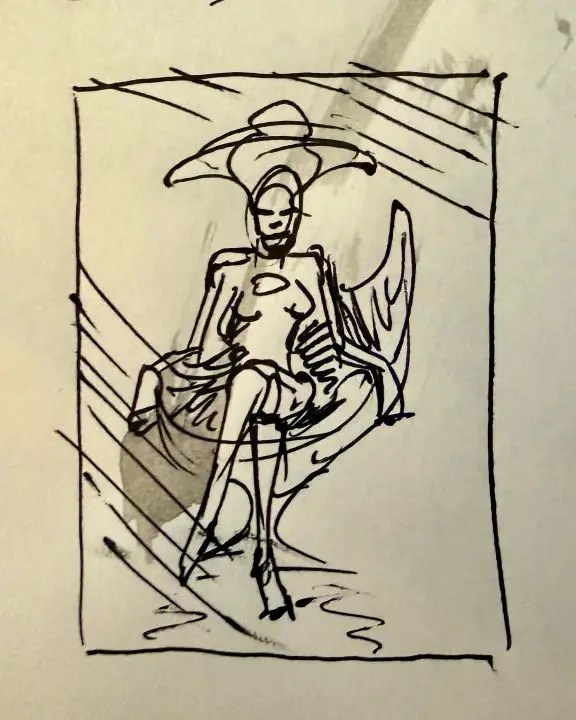
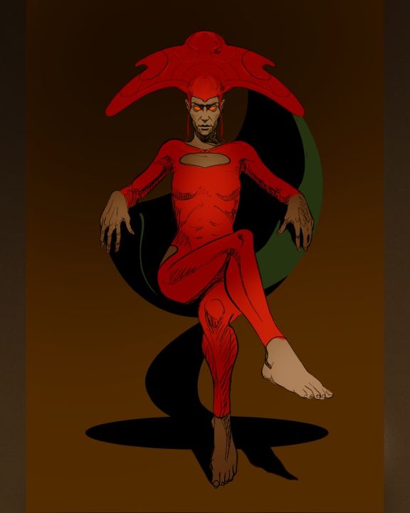
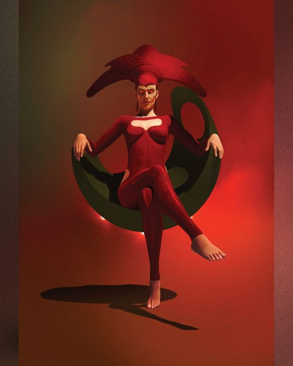
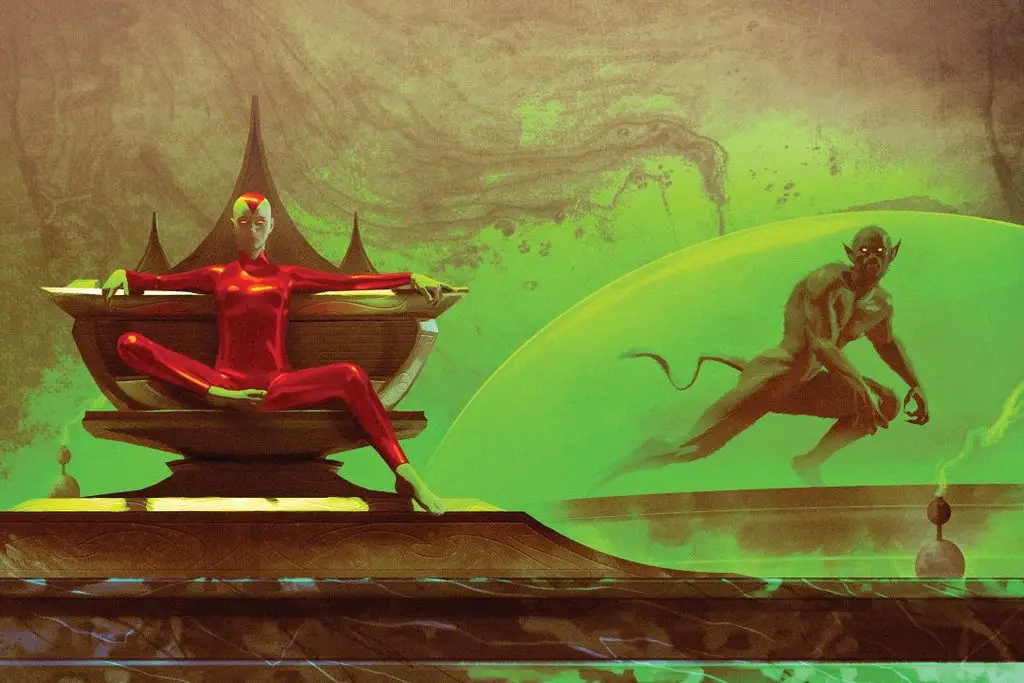
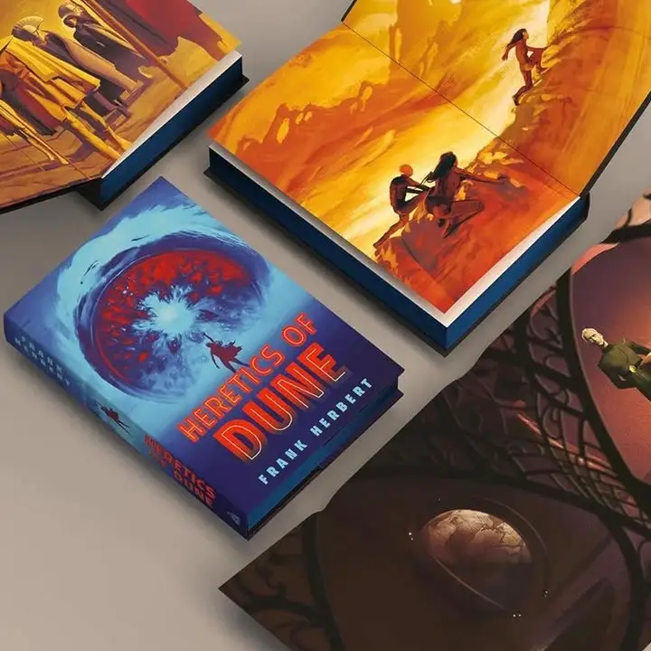
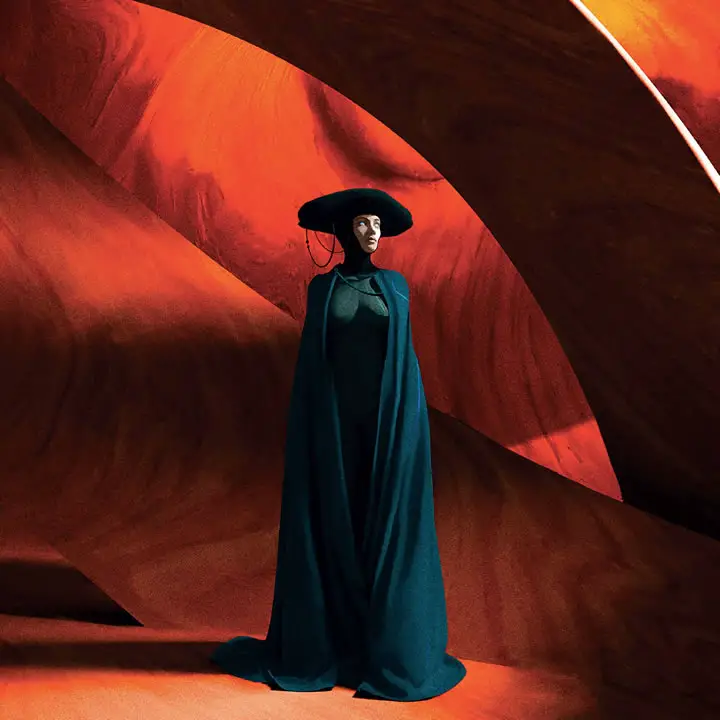
The other one is more recent. Making the art for the Folio Society Heretics of Dune was a really fun challenge, because I had just done that book for Ace. So how can I do the same book twice, very differently? I loved this challenge. One thing I decided was, I was going to lean in to the weird more. So, for example, on the Honored Matre, I gave her a really strange head dress. Not just for the sake of being weird of course – you have to give signals of culture, and otherworldliness. Anyway, I thought the shape was very unique.
Then I watched Dune: Part Two again. And during Feyd-Rautha’s exhibition fight, the ‘assistants’ (Picadors) have a very similar shape on their head. It’s so distinctive, I realised I must have been influenced.
I don’t think it’s avoidable and I think it’s kinda cool really. That’s what we do as artists – we consume huge amounts of culture, it gets filtered and remixed in our brains, we output the results. But hopefully they are unique enough to be distinctly our ‘voice’.
Anyway, it’s a long answer sorry! But a very complicated topic. I could go on for 10 pages but I won’t!
Joshua Cullen (_jozander_): What elements of the Dune universe (technology, characters etc) did you find the most enjoyable to illustrate, and why?
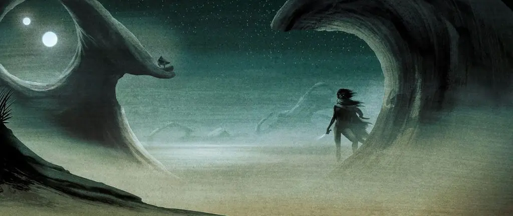
Matt: Very tough question. I think what I try to do most in my work is get across atmosphere. It’s pretentious (again) but I want you to feel something, not just see something. I think that’s why the cover for the first Dune book works – it’s more about atmosphere than anything else. So I would say any images where I can do that, like the sietch for example.
I can tell you what I don’t like in my illustrations and that’s my ornithopters. I just have never gotten them right, in my eyes. Alex Jay Brady does great ornithopters. 😁
I also don’t like how I portrayed Hayt. But, what can ya do?
William Bond Nunn (thevoicethatcooks): What helped inspire your specific imagination and artistic decisions for your art’s interpretations of the Dune universe?
Matt: I think it’s a combination of a lot of things. Love for the source. A passion for films and books, sci-fi, fantasy, science, philosophy, pop culture – and so a lifetime of soaking all that in. My age, I guess (e.g. a kid during the 80s, the greatest period for kids fantasy ever, and very visually inspiring). A lifelong obsession with making art and so picking up some craft along the way. And play – having fun with all of it. Letting the imagination off the leash and experimenting. All of it gets churned up and out comes the art. 😁
Inhale culture, exhale ideas – that’s what I say…
Seth Herzog (herzogseth): Without the Dune games and Dune Encyclopedia to pull from, what are some of the visual touchstones used to build out the 2nd trilogy’s design ethos?
Matt: I think they’re the same touchstones as mentioned above to be honest. I think it all probably has a nostalgic feel to it, because that’s my brain. There’s a huge amount of visual culture swimming around up there because I consume it obsessively! But I hope something new comes out of it too.
I think one unique thing we have is our filter – how our brain processes these external sources, sorts them out and, in my case, puts them back out in the form of art. The influences are there and recognizable, but it’s still uniquely ‘me’. Hope that makes sense!
@morgzart: How would you approach on designing the Harkonnens – specifically, Feyd-Rautha? What kind of inspiration and aesthetic would you implement into drawing him?
Matt: Yeah, I haven’t really shown any of the Harkonnens, have I? I think, had the first books been fully illustrated, I would have. I started a rough sketch of the Baron years ago but it wasn’t good.
I can’t really answer about Feyd specifically because I’d have to go back and read him and then decide. I love how he’s portrayed in the Villeneuve films, but mine would have to be directly from the book. And to do that justice, I need to go back re-read with him in mind and understand and completely immerse myself which, let’s be honest, sounds like a good time.
I think you’d have to do the scene of him fighting Paul. It would also be very hard not to be influenced by Sting and his winged underpants.
Tribalyfe Art & Collectibles (@tribalyfe): What is your favorite Dune book and why?
Matt: Honestly I think it’s Heretics of Dune! It’s more of an old-fashioned adventure story I feel. It builds tension really well. And we get introduced to the Honored Matres and their orange-flecked eyes.
nftsasha (@nftsasha): You use a lot of “haze”, if you will: lack of detail, large swaths of similar color. Is that to represent the dust storms / sand? Just curious about the inspiration behind it.
Matt: Yes as mentioned, I really try to create atmosphere in my work. And I do that mostly with color and texture. So for example on the original Dune cover, the ‘sandstorm’ is ink and water and a wide brush. And combined with color, my hope is that you feel the heat, the roaring of the wind etc. I want to place you there, because I went there to create the image. More pretentiousness, sorry! 😁
With color, I like to be playful and bold. I like taking chances with it. But, when doing a series of books, you have to take repetition into account. So you need a different palette for each cover. But that palette should fit the mood of the story too.
Maciej Drabik (@NegativeVibrat1): Do you start with many different sketches/thumbnails/ideas or is there one vision you like to focus on?
Matt: Yes, there are so many. My copies of the books have notes and post-its on practically every page. But you can’t draw it all.
So I make copious little notes, and I scribble in a notebook – scratchy thumbnails that only really make sense to me. I might have to make a long list of ideas to work through with the publisher, and then it’s on to more refined roughs. These then get approved by the Art Director and the Herbert Estate and then I make the final art.
In the case of the Folio Society edition, where you are placing illustrations throughout the book, you have to take things like spacing into account but also – does it flow with the story? They shouldn’t be a distraction or lift you out of it, especially as you’ve been imagining it yourself as you read. So quite a bit goes into it before the final thing is produced.
Majid (majid_alammari): Which Dune piece are you fondest of?
Matt: It’s a very hard question!
If I had to pick one, gun to my head, it would have to be the original cover. It’s by far my most well-known image and I think, somehow, I really hit on something with it. Maybe I managed to capture the feeling of Dune in that one image and I’m not sure I’ll ever manage to do that as successfully again.
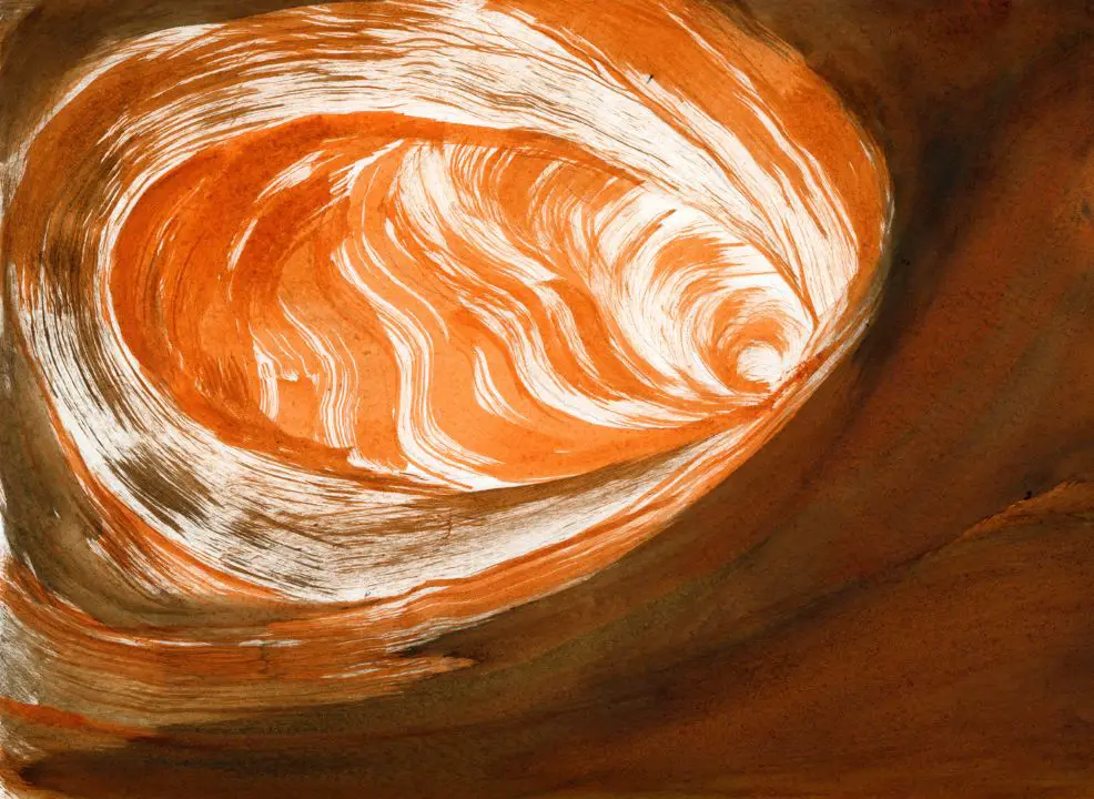
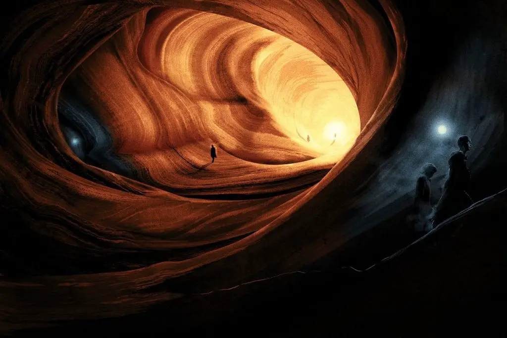
I also like the image of the Sietch because it was very experimental, using ink to create a very specific type of wind-erosion texture, and I’m happy with the composition. It’s almost a little abstract.
All of which is weird because generally I hate my own work not too long after making it. 😁
Conclusion
Thanks for taking the time to answer these questions, as well as your contribution to the imagery of Dune.
In the space of a few months you had four Dune books coming out. Are you all Duned-out, or is there anything you can tease about any upcoming Dune projects?
Matt: I will never be Duned-out. I’m so lucky that I’ve been trusted with the most beloved sci-fi series of all time, I hope I can continue to do it justice as long as possible.
Already teased online, but my poster for Dune: Part Three is coming. Currently awaiting final approval but the art is all done. And I’m also working on another thing. But I can’t talk about it. 😊
Hopefully lots more to come, I’m not done with it yet!
About Matt Griffin
Matt Griffin is an internationally recognised, award-winning Irish artist, author, and storyteller whose work moves between illustration, literature, animation, and emerging digital media.
Rooted in myth, science fiction, and speculative design, his art explores how stories can travel across mediums – and how technology is reshaping the act of storytelling itself.
Matt has created work for Disney, Lucasfilm, Warner Bros, National Geographic, Penguin Random House, HarperCollins and The Folio Society. He is best known for the deluxe editions of Frank Herbert’s Dune series and The Folio Society edition of Arthur C. Clarke’s Rendezvous With Rama, both acclaimed for their atmospheric vision and visual storytelling.
As an author, he wrote and illustrated The Ayla Trilogy (The O’Brien Press), winner of the Literacy Association of Ireland’s Children’s Book of the Year Award. His ongoing multimedia project, The Endling Saga, expands that storytelling ambition into new forms – blending narrative, visual art, sound, and interactive technology to explore the boundaries between myth, consciousness, and digital reality.
His work has appeared in The Hollywood Reporter, Tor.com, io9, Sci-Fi-O-Rama, and Slashfilm, and has earned recognition from The Society of Illustrators, 3×3, Creative Quarterly, and ICAD. He is also known globally for his limited-edition movie posters for Bottleneck Gallery (US) and Vice Press (UK).
Matt lives in County Clare, Ireland, with his wife and three children.